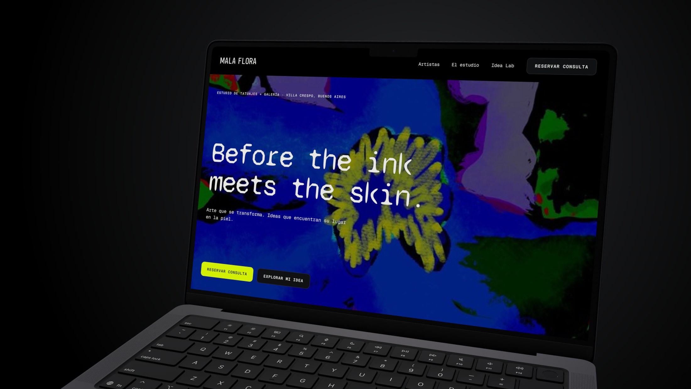
Visual identity, campaign and booking experience for a tattoo studio in Villa Crespo, Buenos Aires — one visual world carried from the street to the screen.
Discipline
Tattoo studio · Gallery
Year
2026
Role
Artist + Art Director
Scope
Visual identity · Original artwork · Campaign · Signage · Web design & interaction
The brief
Objective · Audience · Context
A tattoo studio's hardest moment happens before the ink. The client arrives with an idea they can't quite picture, and the studio has to turn that uncertainty into a confident booking — without a conversation that hasn't happened yet.
The idea
Creative concept
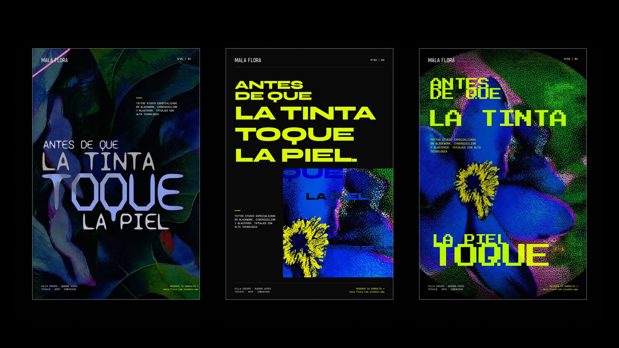
Antes de que la tinta toque la piel. Before the ink meets the skin. Halftone botanicals in acid lime and turbid blue on garden black — the flower rendered the way a tattoo is made: dots, density, pressure. The artwork isn't decoration on the brand; it's the same process the studio performs.
Visual direction
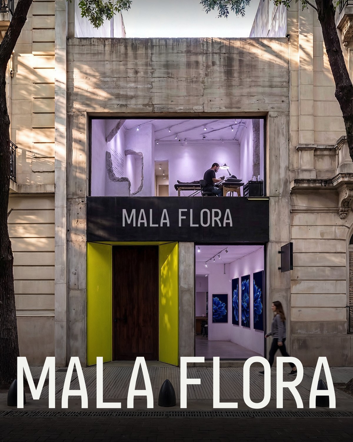
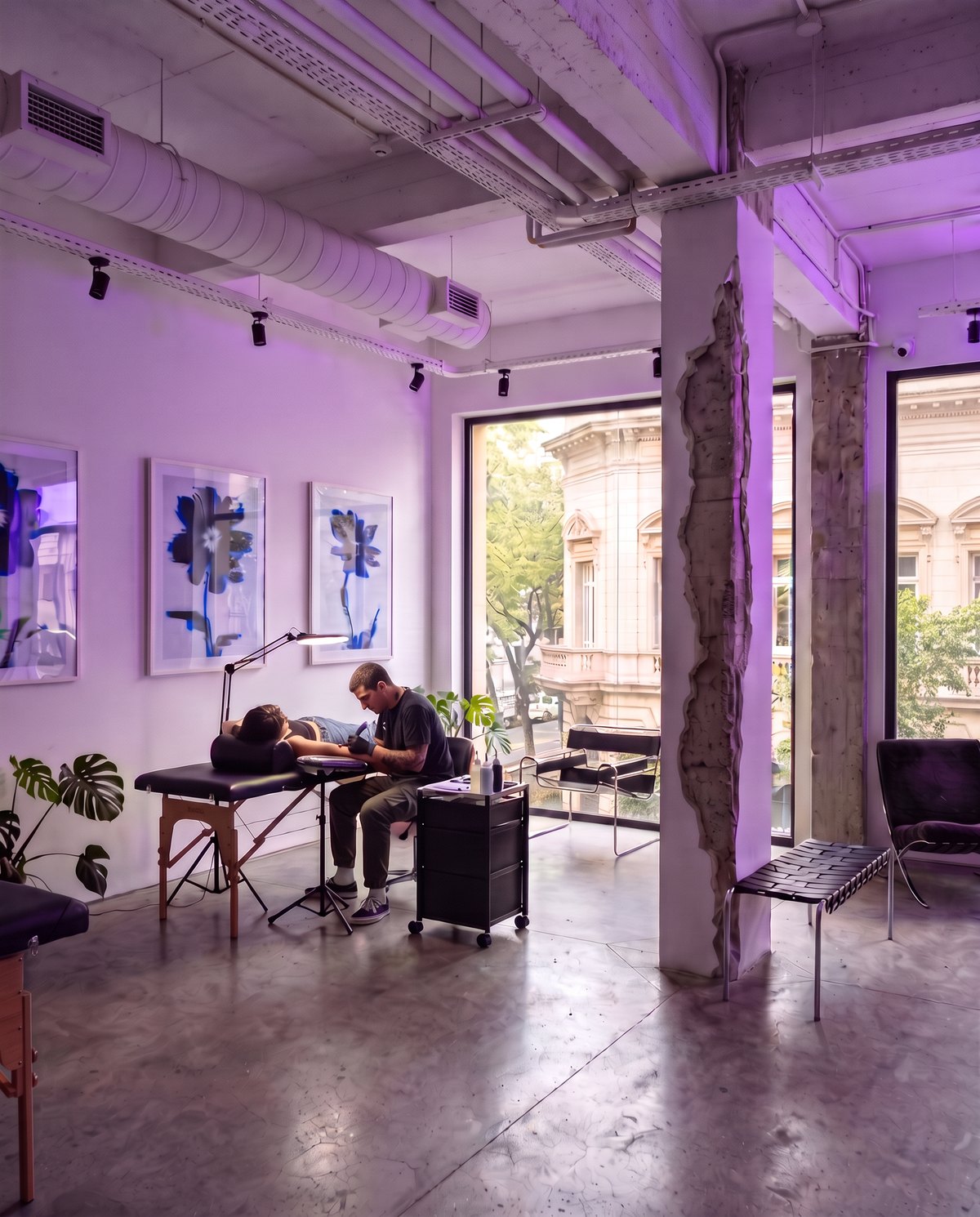
Two floors — a gallery below, open to the street, and the studio above where the tattoos happen.
Generated in Magnific from my art direction, composited with the real artwork and signage in Figma.
Applications
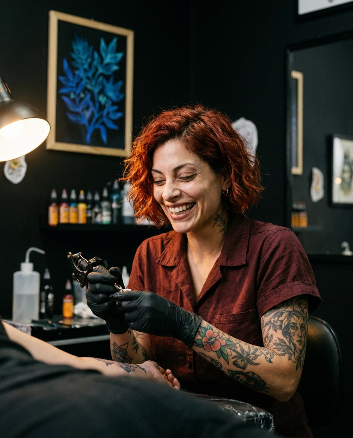
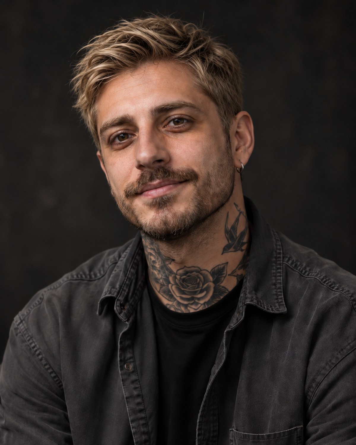
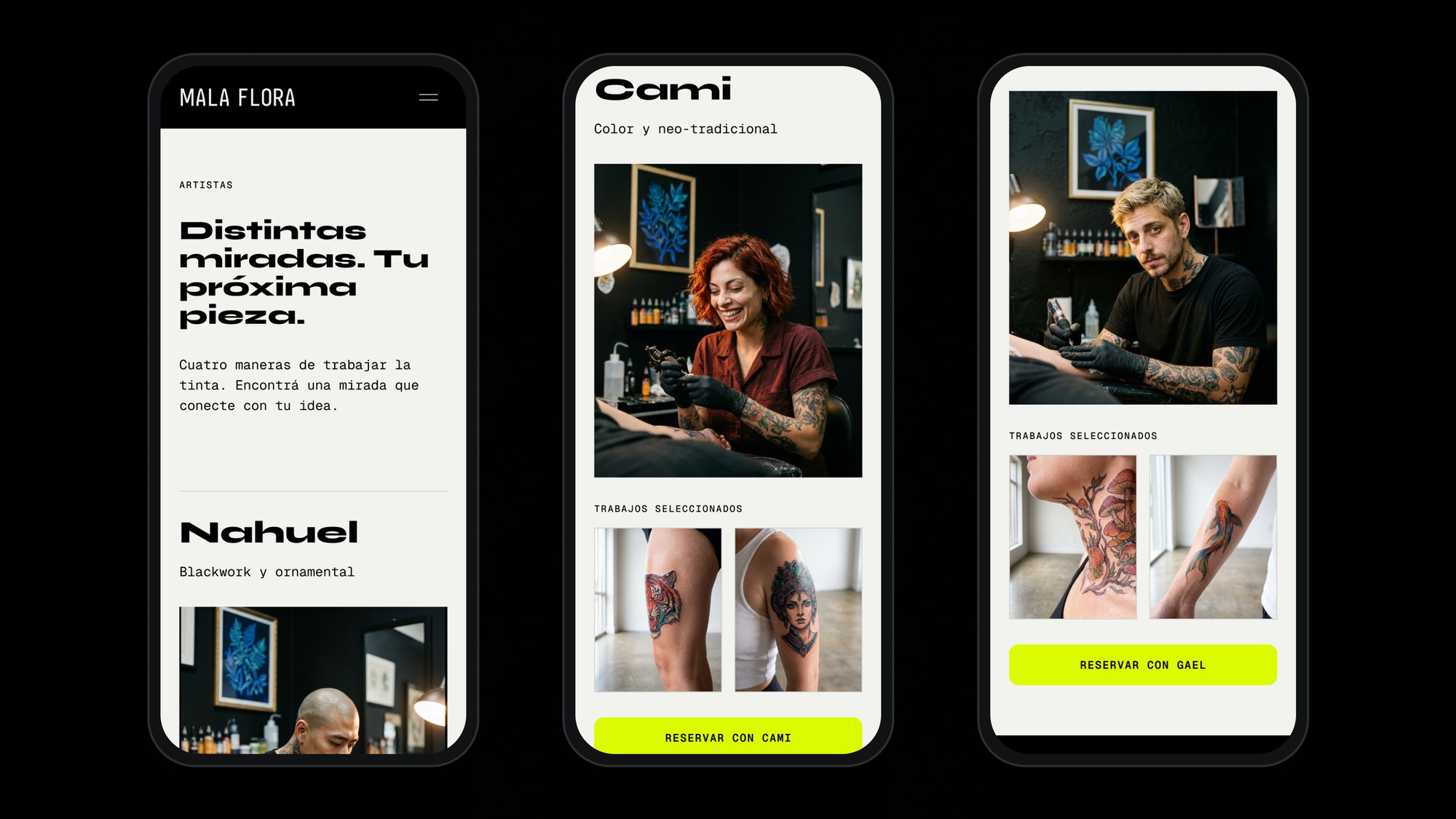
Four artists, four ways of working the ink — each with their own section, their own selected work and their own way in.
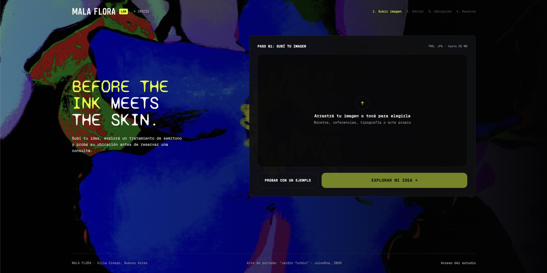
Idea Lab was the decision the whole brand turned on. Instead of asking a nervous client to describe an idea, the site converts their reference into the studio's own halftone, lets them place it on their arm, and books the consultation. The brand's visual language became the tool that converts.
Outcome
A single visual world carried from the street to the screen — identity, original artwork, a three-poster campaign, signage across two floors, and a four-step booking flow on desktop and mobile. The same halftone that makes the posters makes the product.