FLORÉAL

Buying flowers online isn't hard because users don't care. It's hard because emotion gets lost in friction.
The problem wasn't discovery or checkout in isolation. It was the lack of a coherent visual language guiding users from intent to action.
The goal was clear — design an experience where emotion and usability reinforce each other, not compete.
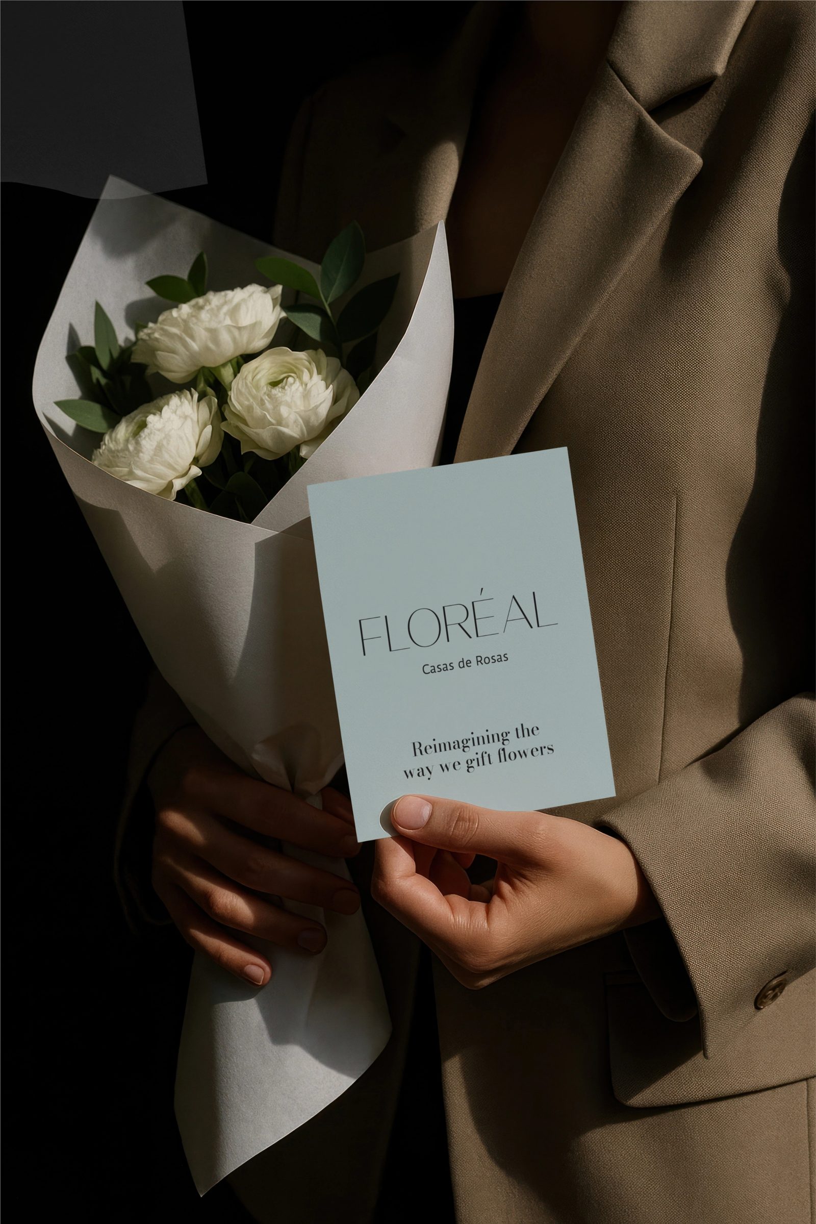
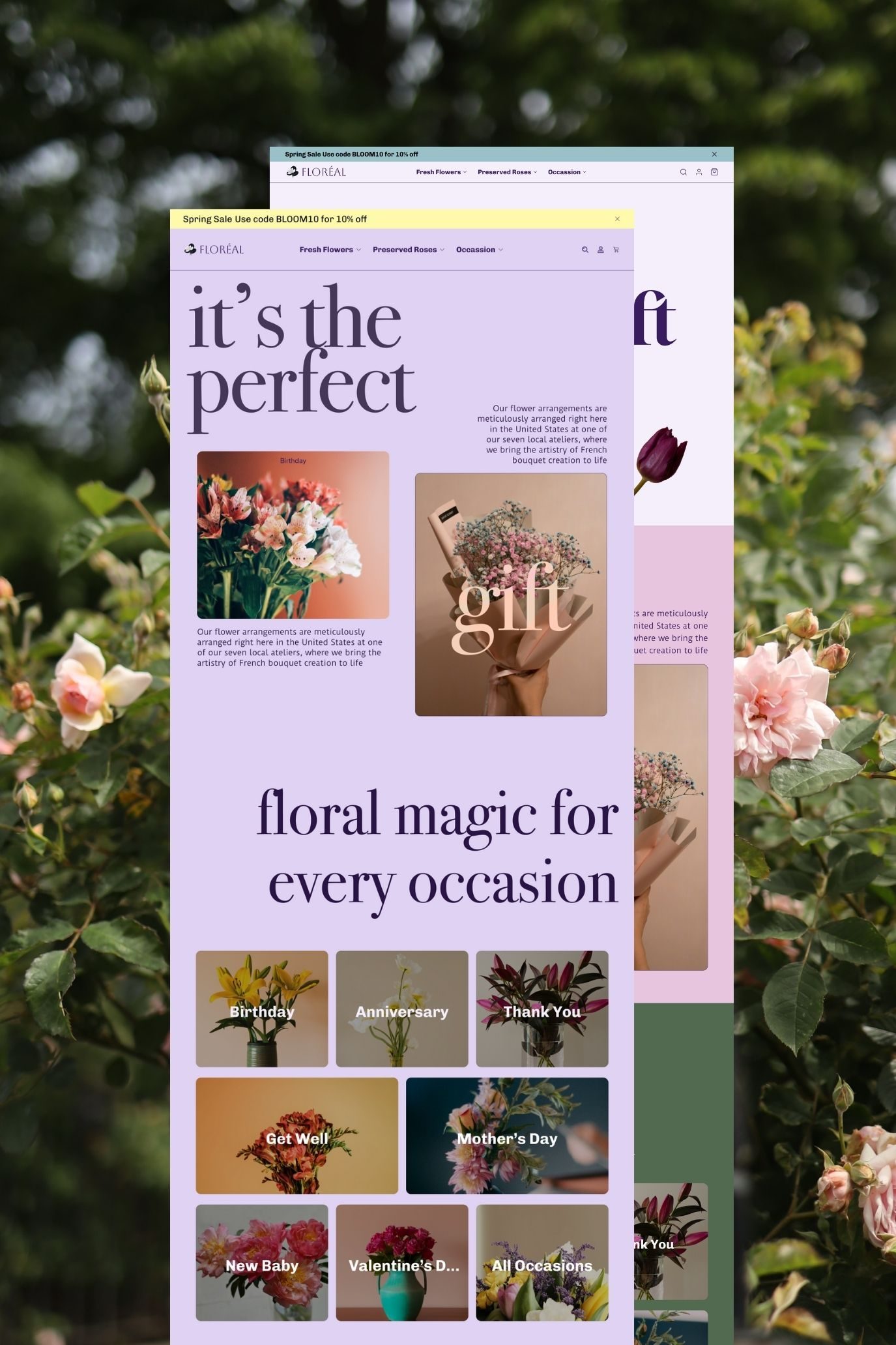
I designed the web and app experience for Floréal starting from the system, not the screens.
Instead of layering storytelling on top of the interface, the interface became the storytelling — every component doing quiet work to move a user from feeling to action.
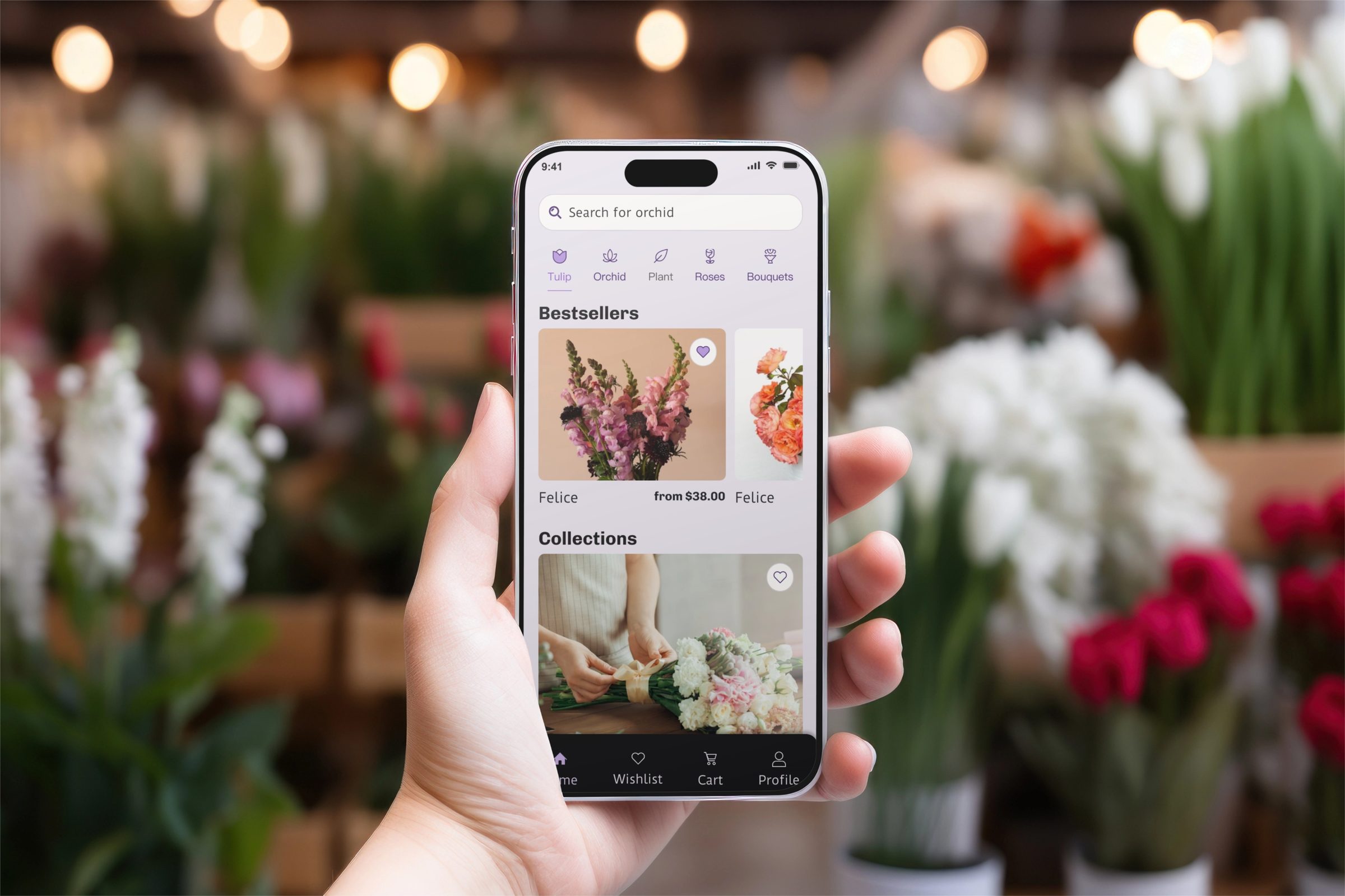
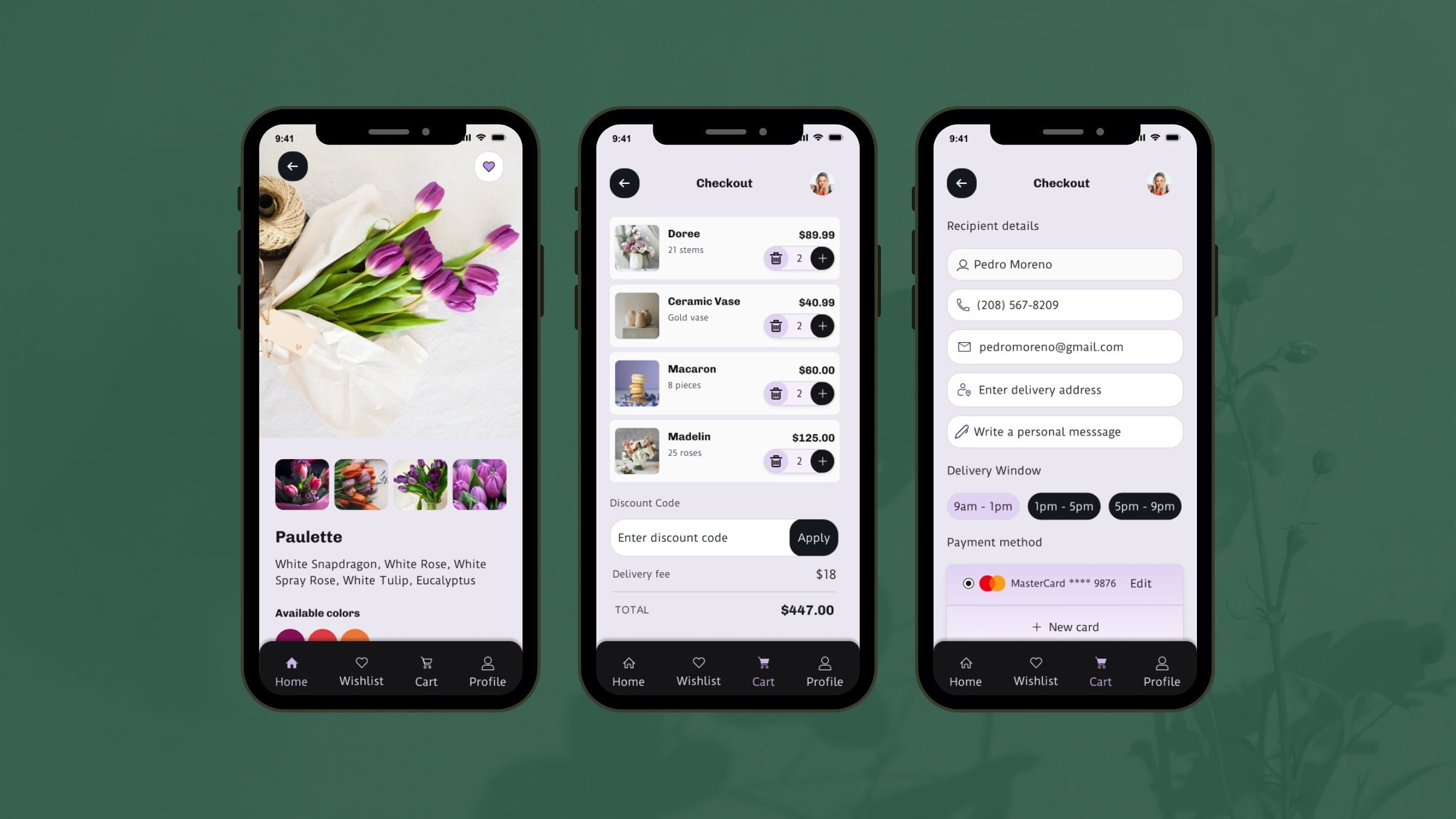
Clarity and restraint can elevate an emotional product — turning gifting into a focused, intuitive experience.